Design is a key influencer of a landing page’s conversion rate. While landing page design wasn’t very important 10 years ago, visitors in 2021 want to see something more modern. What will your business do about this change?
Wondering why your landing page’s bounce rate is high or why it’s not converting as much as your competitors’ pages? You need to work on your landing page design.
With 55.73% of global traffic being mobile, 8 seconds to leave an impression, and the average landing page conversion rate being a meager 2.35% (plus a -7% conversion with every second lost), you can’t afford to leave out responsive design.
So with that in mind, let’s take a look at the top landing page design best practices and examples for maximizing your lead generation.
Already thinking about launching your business? Build a high-converting landing page with Leadpages for $27/month (save $120/year) with my link below.
Ultimate Guide to Landing Page Design (2021)
- 5 Best Practices for Designing Landing Pages
- 7+ Landing Page Design Examples
- 5-Point Anatomy of a Perfect Landing Page (Featuring Leadpages & Unbounce)
Disclosure: This post includes affiliate links that I get a commission for at no extra cost to you. However, I only mention the best resources for you to step up your marketing game – nothing less.
5 Best Practices for Designing Landing Pages
Before we get into our amazing list of landing page examples, let’s cover a few things the best lead capture pages tend to have – all hand-picked tips after looking through over 100 landing pages.
1. Focus
Landing pages should focus on having one goal and one call-to-action (CTA) with minimal distractions e.g. navigational bars, clickable external links, etc.
While this might be common sense to you, just know that 48% of landing pages contain 2+ offers, 58% of companies use clickable graphics, and an overwhelming 84% of landing pages have navigation bars.
While we can’t be sure what the exact numbers are, we can be certain that businesses who implement those 3 no-nos are the reason the average conversion rate is just 2.35%.
2. Minimize Scrolling
A good landing page has a visible CTA button above the fold (without scrolling).
It’s your headings’ job to let the visitor know what your product or service is. If someone needs to scroll to the bottom to find out what you do, you earn yourself a bounce.
But sometimes, you’ll need a bit more information than a few lines. In that case, it’s fine to use long form copy, but don’t make it any longer than necessary.
3. F or Z Patterns
Humans tend to look at websites in F and Z-shaped patterns (which explains why SERP are designed the way they are).
A common practice for landing pages is having headings and the CTA on the left of the page with a big image or video on the right.
4. Consistent Branding
Your customers should recognize your brand the instant your landing page loads.
It’s not hard. Just use the same fonts, color scheme, logo, and types of design for images, infographics, graphs, etc.
5. Engaging Visuals
You want the images on your lead gen pages to contribute to your product’s goals so customers have an idea of what your product does.
Do your images need to be hyper-relevant? Not really.
But just keep in mind that these visuals (images, graphs, videos) are used to let the visitor’s eyes take a break from looking at text.
Pro tip: Use a graphic design tool like Visme to help out with creating engagin visuals.
Think you know enough about landing page design? Get started with Leadpages for just $27/month with my link.
Disclosure: This post includes affiliate links that I get a commission for at no extra cost to you. However, I only feature the best resources to help you generate more leads – nothing less.
The Best Landing Page Design Examples in 2021
These following are some of the most professionally designed and optimized landing pages on the web.
Check these seven examples out and try to implement these designs into your own landing page creation strategies.
If you want to see more (with detailed explanations), be sure to take a look at my landing page examples roundup here.
Note: To see the full pages in a lightbox (same tab, same window), just click on the images.
1. Instapage

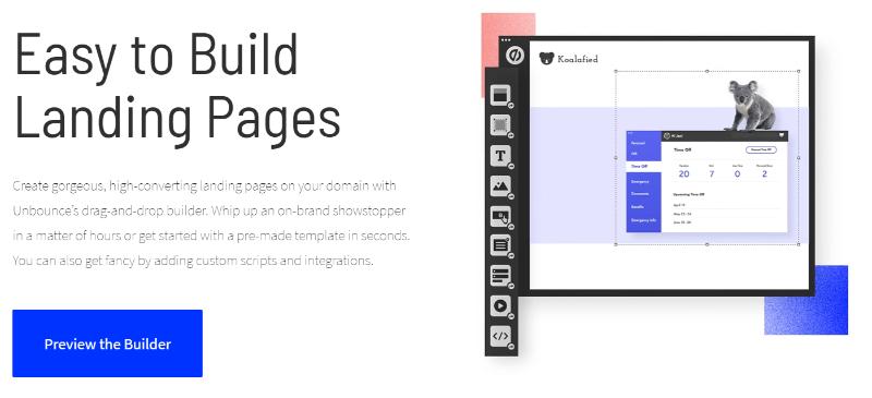
2. Unbounce

3. Thinkific

4. Weebly

5. Livestorm

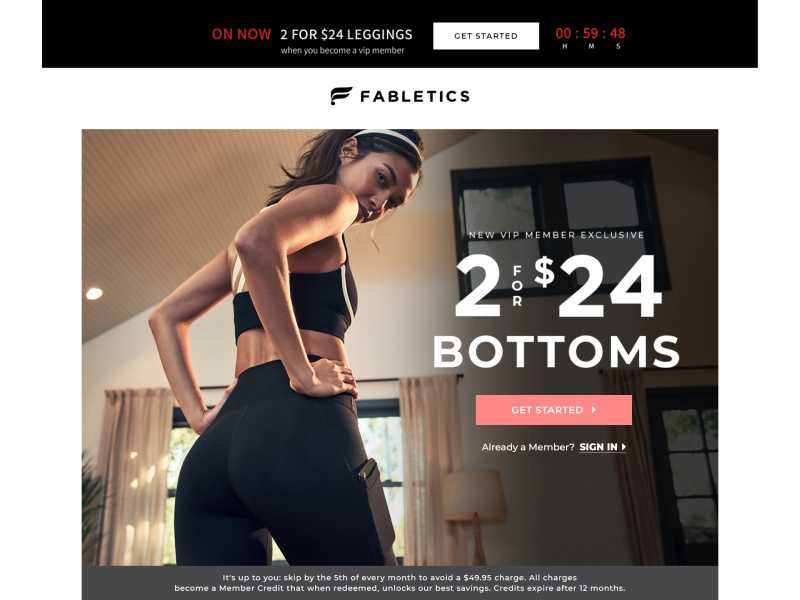
6. Fabletics

7. Shopify

8. Buzzsprout

These are just seven of the best landing page designs in the SaaS and marketing industries.
For more (and more detailed) design examples, check out my post on landing page examples.
Alternatively, if you’ve decided you know enough about designing landing pages and have an idea of what you want to create, check out the top converting landing page templates (some are free!) and page creation software.
Have you seen a landing page design you’re ready to take inspiration from? Make your imagination come to life for just $27 with Leadpages.
Not interested? Then let’s dive into the unique 5-point formula for “perfect” landing pages.
5-Point Anatomy of a (Near) Perfect Landing Page
Here’s an little graphic by Leadpages (#1 affordable landing page builder) that shows you the key points.
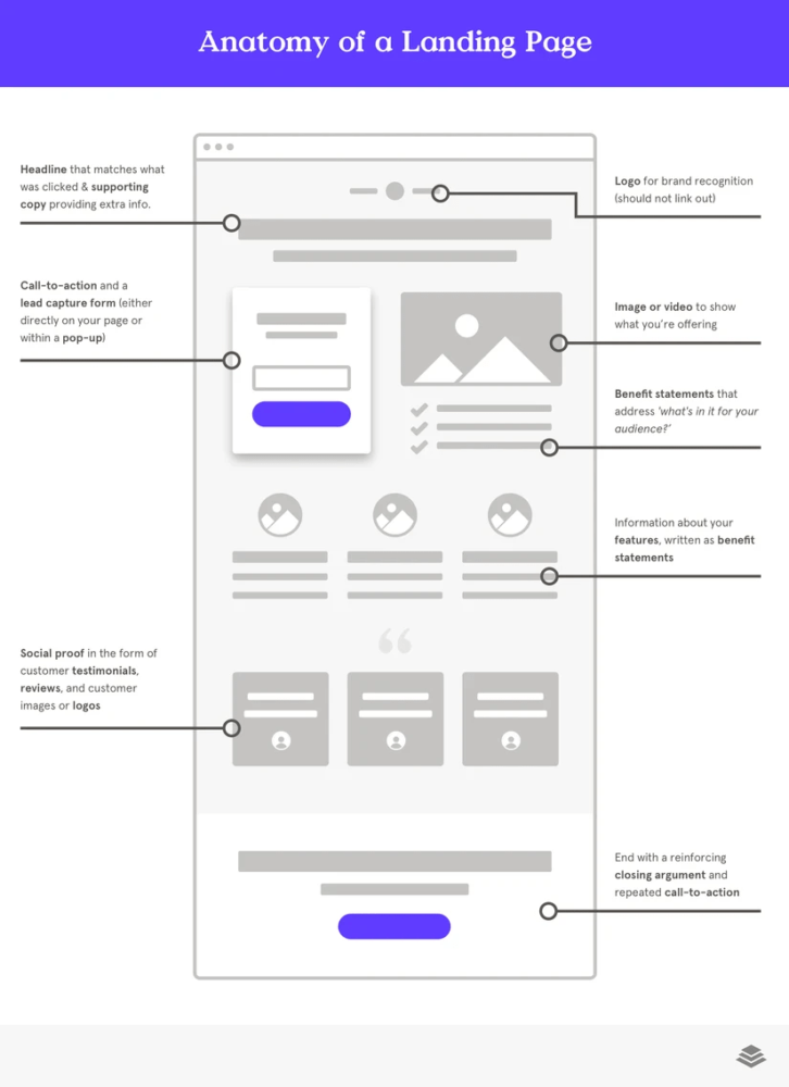
To sum it up, here is Leadpage’s formula for creating a high-converting landing page.
- Headline
- Logo
- Explainer video/image
- CTA and form
- Benefit statements
- Features
- Social proof
- Reinforcement (CTA V2.0)
Like we’ve mentioned a few times before, the call-to-action is the “focus” of the entire page and should be used to collect emails, close sales, or offer demos and trials.
Here’s another image, from Unbounce (#1 landing page builder) that explains what landing page designs should have – with great examples of the right copy.
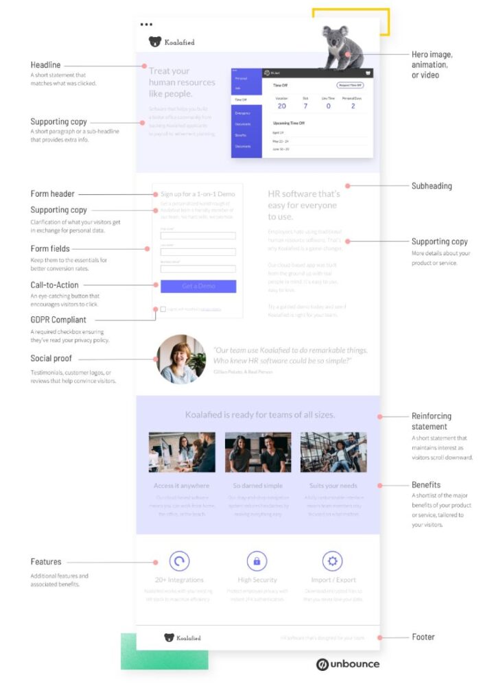
Components of a Landing Page
These are the 5 base components of a high-converting landing page design according to Unbounce.
- Unique selling proposition (USP)
- Informational hero image/video
- Benefit statements
- Social Proof
- Call-to-action (CTA)
Pretty similar to what Leadpages had in mind in their landing page anatomy chart.
Let’s take a shallow dip into what these components are. For a deeper dive, check out my complete guide on landing page optimization tips where I cover this section (and more) in a lot more detail.
1. Unique Selling Proposition (USP)
This is what sets your product or service apart from other competitors in the niche.
Pro tip: Your USP doesn’t necessarily have to be unique. Google, Tesla, Uber, and a ton of others weren’t even close to being the first ones to do what they do best now.
Here are 2 most important (out of 4) elements that you’ll need to craft the perfect USP.
a. Main Headline
The main headline is the first thing your visitors will see when they visit your landing page. Think of it as a “welcome mat.”
This is the first thing that Shopify’s landing page shows for “how to set up a secure shoping cart.”
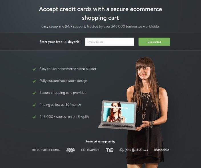
It can’t get much better than that. The headline is clear, concise, and includes an embedded CTA as a bonus.
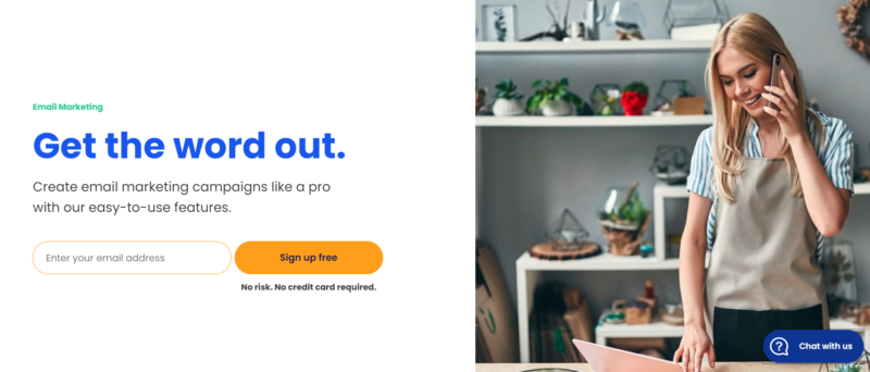
b. Supporting Headline
Think of supporting headlines as the fries that go with your burger,
These headlines should provide more info but should still be brief and straight to the point.
Here is a post-click landing page from Constant Contact (#1 email marketing software) with an excellent supporting headline.
For the smaller conversion optimization tips to get that little .05% increase in leads, check out my guide on landing page optimization here.
If you’ve decided to take the leap and watch your leads soar, start with Leadpages for $27/month. You won’t regret it.
Disclosure: This post includes affiliate links that I get a commission for at no extra cost to you. However, I only feature the best landing pages to get you more leads – nothing less.
2. Hero Image or Video
This is just about as important as the main headline since it usually fills the majority of a visitor’s screen (some exceptions like the one below from Unbounce).
You want to focus on “vibing with your niche.”
If you’re in the clothing niche, having an agency/SaaS type of hero image wouldn’t do much good for wannabe influencers.
Instead, a visual with the product itself (preferably someone actually wearing it) would be more fitting.
Here’s a good example from Fabletics.
3. Unique Features
So your landing page has your catchy headings and image, but why would a customer choose you over another similar company?
What you need is a summary or description of your unique features and benefits.
Features: A feature is something your service offers. A good example would be the “drag and drop page builder” Unbounce has. Think “what.”
Benefits: Benefits are the positive aspects of the product. For instance, you could push the notion of “building a website without technical knowledge.” Think “how.”
Here’s an example of a feature/benefit statement done well by my buddies over at BacklinkManager.io (the first and best CRM tool for link building):
“BacklinkManager will monitor your links and collaborations, making sure partnership management is tip-top.”
Side note: If you’re big on link building collaborations and are looking for an easy-to-use dashboard for partnerships, feel free to check out BacklinkManager.io (from just $19/month).
4. Social Proof
Social proof is leveraging others’ influence in order to convince a buyer to make a certain decision.
Some of the ways landing pages can implement social proof are:
- Logos of customer companies
- Review scores from Capterra, Trust Pilot, Amazon, G2, etc.
- Case studies
- Video testimonials
- Quotes from customers/clients
The list goes on and on. It’s really about finding the “right type” for your service, niche, and intended audience.
While you may see forms of social proof everyday, not many people think much about it.
But think back at the time you bought that last product or software. I’d bet all my rankings that social proof played a role in that decision.
What to avoid with social proof
Never put misleading information.
If Patt Flynn didn’t say your course creation tool was great, then don’t add a testimonial from him.
If Ryan Robinson didn’t recommend your podcast hosting platform, you probably shouldn’t mention him as a “loyal customer.” (Ryan’s a great guy btw)
Pro tip: Use real photos of customers to make the testimonials and reviews more convincing.
5. Call to Action (CTA)
The CTA is arguably (I’d say 100%) the most important aspect of your landing page design.
No CTA, no landing page.
Your landing page call-to-action should be a button or form designed for generating leads whether they’re sales, demos, trials, or contact info.
Use clever button text instead of a general “Click Here.” Think of a 2-4 word phrase that visitors will take interest in.
A common example that tends to work pretty well is “Start Your Free Trial” and stuff along those lines.
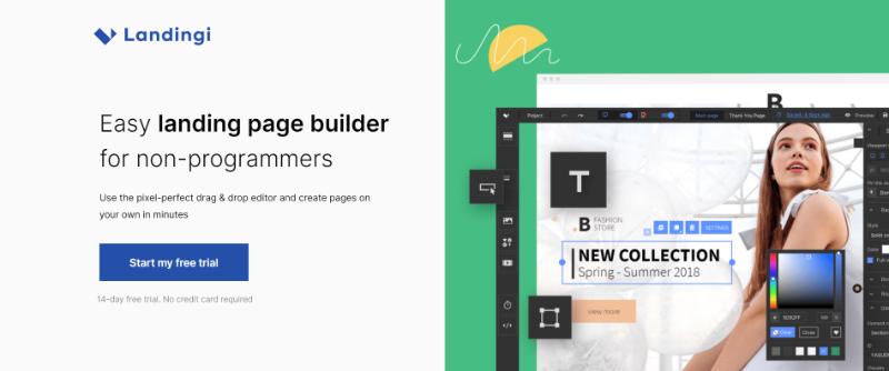
Here’s a splendid example by Landingi (#1 easiest no-code landing page builder).
Wrap Up
Well-designed landing pages should aim to:
- increase focus
- minimize scrolling
- follow F or Z patterns
- maintain consistent branding
- and engage users with visuals.
The basic 5-point anatomy of a landing page design includes:
- a unique selling proposition (USP)
- an informational hero image or video
- features and benefits
- social proof
- and most importantly, a strong call to action (CTA).
And that sums up everything you need to know about designing landing pages.
Since you’ve made it this far, to thank you for your time and desire to build the perfect lead gen page, here’s a little gift.
Start designing your landing pages with Unbounce for $64/month (that’s 20% off your landing page software). This is not a deal you see everywhere; most are only able to offer a 10% discount ($72/month).
Disclosure: This post includes affiliate links that I get a commission for at no extra cost to you. I’d like to note that Unbounce is, hands down, the #1 best landing page builder – just not quite as affordable as Leadpages.
Further Reading on RickyWang.com: If you liked this post, you should check out my guide to landing pages, check out some high-converting landing page templates, or get started with a landing page builder.
If you’re looking for something else related to landing pages, check out the entire series here 👉 Landing Pages: A Marketer’s Handbook.
And leave a comment below on what you thought about this guide!